Percepto
Remote ID: from business blocker to a shippable cross-device journey
The world's most advanced autonomous drone operations platform — FAA compliance UX, mission creation, and pre-launch checks for field engineers.
Context
Percepto builds autonomous inspection and monitoring systems for industrial sites. Operators need products they can trust in real field conditions — where connectivity is unreliable, time is constrained, and mission success depends on every interaction being clear.
This project focused on Remote ID: a US regulatory requirement that made drone location and operator location part of the product itself. I joined before engineering locked a build path. My role was to help frame the problem clearly, align Product, Legal, Support, and Engineering around one system model, and turn a regulatory requirement into a practical user journey that operators could actually complete in the field.
The challenge
The first design task was not the interface.
It was making the regulation concrete enough for the team to build against. Remote ID wasn't a normal feature request. It introduced a new operational requirement into an already complex product.
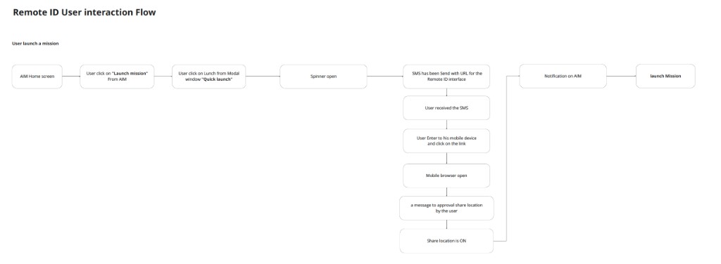
For a flight to comply, the system had to share both drone location and operator location at the right time, through the right device, without breaking the mission flow. That meant the user experience spanned multiple contexts: the AIM platform, the operator's mobile device, browser behavior, permissions, GPS access, and field conditions.
But the technical challenge was smaller than the team alignment challenge.
Different teams were carrying different mental models of the problem. Product was focused on shipping. Legal needed compliance certainty. Support worried about operator confusion. Engineering debated implementation risk. Until those views came together, there was no stable product direction to design against.
This made the work bigger than a flow design problem. It was a product-framing problem shaped by regulation, user trust, and system constraints.
Research
Understanding the real problem.
Before proposing solutions, I needed to understand where the real risk lived. I anchored the work on product OKRs and the regulatory requirement, then spoke with operators in the field to understand how the product was actually used under pressure.
I also worked closely with PM, Support, and Engineering to map current assumptions, failure points, and dependencies across the system. The goal wasn't to generate more research volume. It was to build enough research density to make the team argue from one shared reality.
That work led to a clearer model of the journey:
- When operator location had to be collected
- What device could provide it
- What happened when permissions failed
- How to preserve mission context while moving between devices
- What error and recovery states the product had to support
Once that system model became visible, the UX problem became much easier to reason about. The team could stop debating the "what" and start designing the "how."
Strategic reframe
Start from the product risk, not the wireframe.
The most important move in this project was stopping the team from treating Remote ID as a screen problem and reframing it as a system problem.
If we had started too early with interface mockups, we would have been designing against incomplete assumptions. The real work was to define the logic first: what had to happen, in what order, on which device, under which constraints, and with which recovery paths.
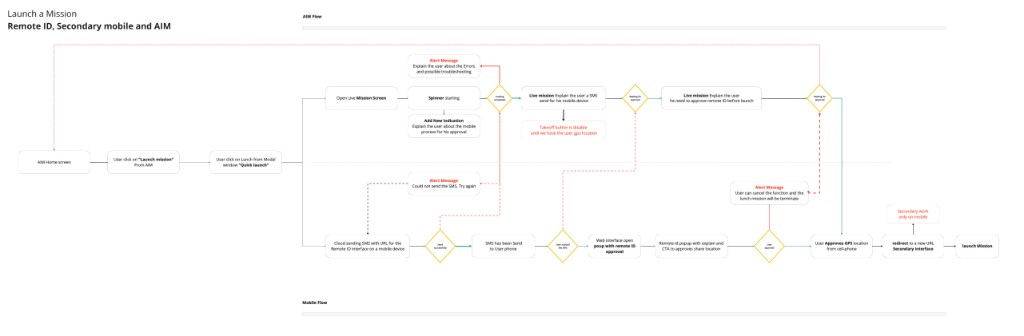
That changed the quality of the conversation. Instead of debating UI too early, the team could align around one shared system truth. That meant clarifying:
- Where the operator enters the flow
- When location must be requested
- What happens if the native permission prompt is denied
- How the product responds when location is blocked
- How the user returns to the mission context after the secondary device step
Compliance UX is stakeholder UX. If Remote ID failed, Legal, Support, and Sales all paid the cost.
The turning point wasn't a visual solution. It was making the problem concrete enough for the product team to commit to one direction.
Design approach
Four moves that shaped the direction.
1. Build one shared system model before exploring screens
The team needed a single model of the journey before discussing visuals. I helped map the cross-device flow across AIM, the mobile device, location permissions, and the return path back into the mission experience. This gave Product, Legal, Support, and Engineering one shared structure to debate instead of three competing ones.
2. Treat edge cases as part of the product, not exceptions
Remote ID depended on location access, which meant the UX had to support failure states clearly. That included blocked location, denied native prompts, successful authorization, and devices without GPS capability. Each of these needed explicit guidance and recovery, not just generic error handling.
3. Preserve mission context across devices
The flow couldn't feel like a detached compliance detour. Operators needed to understand why they were leaving one interface, what they had to do on mobile, and how they would return without losing context. The design needed to reduce confusion while keeping the operational goal intact.
4. Design for practical Phase 1 shipping, not idealized completeness
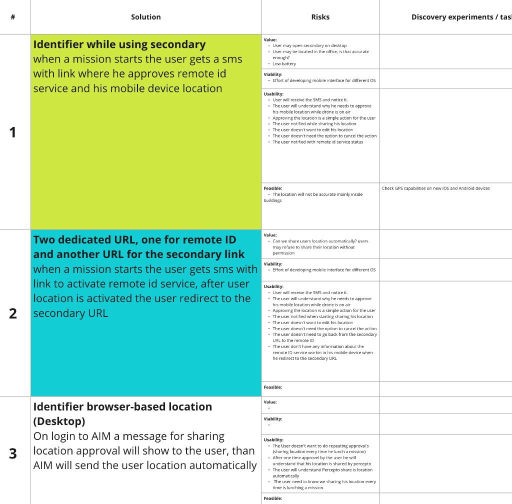
The final direction had to be shippable. The outcome wasn't one abstract "best" concept, but a clearer system model, multiple viable directions, and a practical Phase 1 path the team could actually build against.
Outcome
A clearer path forward.
Remote ID moved from an abstract regulatory requirement into a product journey the team could reason about and commit to.
For the business: A clearer path toward US salability and operator trust.
For the user: A journey that reduced confusion in a high-friction flow by making states, transitions, and recovery explicit.
For the team: Competing assumptions replaced with one shared model. Instead of debating "should we do this?" they could focus on "how do we build this?"
Product defined success as operator and drone location being shared as required, with no mission cancellations caused by missing Remote ID data. That became the bar everyone designed against.
The value wasn't only the interface direction. It was reducing ambiguity early enough that the product could move forward with more confidence.

In the field
Remote ID in action — the AIM platform with live drone feeds, showing how operators interact with compliance flows in real mission contexts.
Reflection
What this taught me.
What stayed with me
- In ambiguous product spaces, the first design task is often framing the real risk clearly enough for the team to act.
- Research density matters more than research volume. A small number of operator conversations, mapped carefully against the system model, was more valuable than a large study with no clear direction.
- Compliance changes the shape of UX. When the product has to satisfy regulation, the user journey has to work not only for the operator, but also for the business, legal context, and support reality around it.
What this case shows about me
This case study shows how I work before the UI is fully visible. It reflects how I approach ambiguous product problems, how I align teams around one clearer system model, and how I use UX thinking to turn risk and complexity into a practical product direction.
The most valuable thing I did in this project wasn't drawing screens. It was making the problem visible enough that the team could stop debating it and start building against one direction.