Bank Hapoalim employee portal — Hebrew UI with global search drawer open, showing contact and categorized results

Bank Hapoalim

From a fragmented employee workday to one coherent internal system.

Reducing friction across 12,000 employees — not by redesigning two interfaces separately, but by treating the portal and app as one connected system.

Enterprise UX · research at scale 12,000 employees · 752 surveyed

Scale

Research & reach

12,000
Employees using the system
752
Survey participants
13
In-depth interviews
10
Usability tests

The challenge

When internal tools create friction, the cost is not only employee frustration. It affects the service the organization can deliver.

Bank Hapoalim brought me in to redesign two connected internal products: the employee web portal and a new mobile companion app, Portal to Go. These were not consumer-facing experiences. They were daily operational tools used by employees to find information, manage attendance, access internal systems, and move through the workday with less friction.

The scale mattered. Around 12,000 employees depended on these tools, which meant small UX problems could become large operational costs.

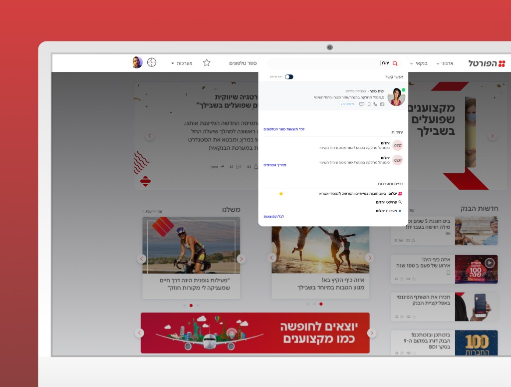
Fragmented experience

The portal and app behaved more like separate tools that happened to live in the same organization — not as one coherent system. Employees needed faster access to information, clearer daily work management, and better mobile support for critical tasks like attendance.

Friction across the workday

The real problem was not a single broken flow — it was friction distributed across the employee workday. Information was hard to find. Daily tasks were disconnected. Mobile support for field workers was unreliable. The products did not support how people actually worked.

Scale without clarity

Inside large organizations, assumptions affect thousands of people. Without strong research, the redesign would have been built on guesses. The project needed a solid foundation of real employee behavior before design direction could harden.

Research before direction

Before redesigning the products, I needed to understand where the friction was most costly.

The research phase combined broad quantitative input with focused qualitative depth. Survey responses from 752 employees helped reveal patterns at scale. Interviews and usability tests helped show how those patterns translated into real work behavior.

This research did more than validate isolated usability issues. It clarified where the products were creating friction across the workday, what employees needed most often, and which tasks had the highest operational value. That gave the project a clearer foundation for prioritization. Inside large organizations, assumptions affect thousands of people. Research was not only a discovery step here — it was a way to reduce expensive misalignment before the design direction hardened.

The key decision

The project became stronger when I stopped treating the portal and the app as separate interfaces.

The default framing

Two product redesigns running in parallel — improve the portal, then improve the app. Cleaner interfaces, better individual flows, delivered separately.

The reframe

One system redesign — reduce friction across the employee workday. The portal becomes the central daily workspace; the app extends the most critical actions to mobile. One shared logic for what belongs where.

That changed the design question from "How do we improve each product?" to "How do we reduce friction across the workday?" — and made every subsequent decision easier to reason about.

Product

Full portal view

Full employee portal homepage

Design moves

Four moves that shaped the redesign.

1. Make search the primary action on the portal

The portal homepage centered around internal search because employees needed quick access to loan information, product details, and procedural knowledge while speaking with customers. Search results unified people, pages, and systems under a single query, making the portal more useful in real work moments.

2. Turn the portal into a personal work tool

A personal workspace area gave each employee a more useful starting point for the day, with quick access to contacts, notes, favorites, account information, calendar items, and key systems. The portal became less of a broadcast surface and more of an operational hub.

3. Design the mobile attendance flow for real conditions

Portal to Go focused on attendance reporting as a critical compliance task for mobile employees and field workers. The flow was redesigned around speed and clarity — entry and exit actions, strong time visibility, fingerprint authentication, remote-work mode, and fallback reporting when problems occurred.

4. Reduce first-use friction through progressive disclosure

Usability testing on the mobile onboarding flow showed where first-time users became overloaded. The final direction introduced essential functionality first and revealed deeper capabilities over time, reducing cognitive load without flattening the product.

Navigation

Portal menu

Portal navigation and menu

Outcome

A more coherent internal system — with faster access, better workflow support, and stronger day-to-day usability.

Information became faster to find. Daily work management became more consolidated. Critical mobile actions became easier to complete under real-world conditions. Most importantly, the bank moved closer to one coherent internal system across web and mobile — rather than a collection of disconnected tools.

The outcome was not only better usability. It was a stronger operational product foundation for employees whose daily efficiency directly affects the quality of service the organization can provide. Internal UX is business UX. When employees move faster and with more confidence, the whole organization performs better.

Michal Accos presenting the Portal project at UXI Live — stage screen shows work process stages and card-sorting research
Michal Accos, Director of UX, presenting the Portal project at UX Israel Live conference — validating the scale and impact of the work.

Reflection

What stayed with me.

Research matters more at scale. Inside large organizations, assumptions affect thousands of employees. The 752-person survey did not just validate a direction — it revealed the gap between what the organization thought employees needed and what employees actually needed to get through the day.

Internal tools deserve product-level thinking. Better employee systems improve both productivity and the quality of customer service. Internal products should be treated with the same seriousness as customer-facing ones. The friction an employee feels is the friction the customer eventually feels too.

Workflow matters more than screen polish. Reducing friction often means redesigning the workday logic behind the interface, not only improving the interface itself. The portal and the app were not the problem — the fragmented workday they created was the problem.

This case study shows how I approach service and workflow problems inside complex organizations. It reflects the way I use research to find the real friction, connect multiple products into one clearer system, and turn internal UX into a more practical and more valuable product experience.