Field operator in a high-visibility vest holding a rugged tablet showing PRIMUS mission map and overlays at an industrial site

Airobotics · 2016–2018

From rough beta prototypes to two production-ready drone platforms.

Industrial drone systems for refineries, chemical plants, and high-stakes facilities — PRIMUS for real-time mission control, Insightful for flight analytics.

Product Design Lead Design Systems Team Leadership 2016–2018

Context

Two products. One high-stakes environment.

Airobotics builds automated drone systems for industrial environments — refineries, chemical plants, manufacturing facilities. When I joined, both products existed as rough Photoshop prototypes: inconsistent by screen, built without a shared interaction language, designed without a system underneath.

Over three years, I shaped two production platforms: PRIMUS for real-time mission control, and Insightful for post-flight analytics. My role spanned product design, design leadership, and building the infrastructure that let the product scale without losing coherence.

The Challenge

Designing for live operations, not just screens.

In mission-critical software, ambiguity is not a usability issue. It is an operational risk.

PRIMUS was a real-time operations platform where users monitored drone status, active missions, weather, and map state simultaneously. Every screen carried operational weight — a misread or missed state had real consequences in the field.

Insightful was an analytics platform designed to turn flight logs, mission history, and performance patterns into decisions operators and managers could actually act on.

What made both products difficult was the context around them. Emergency landing, parachute deployment, and Flight Termination System actions had to stay accessible under pressure — while protecting against accidental activation. These are not the same problem. Each required a different level of friction calibrated against consequence and reversibility.

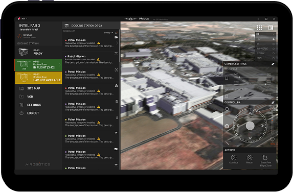
01 · Safety-critical actions with the wrong interaction model

Emergency landing, parachute deployment, and FTS all needed to stay accessible under operational pressure while protecting against accidental activation — each a different problem requiring different levels of deliberate friction.

02 · High-density information competing for the same attention

Operators needed to simultaneously read live drone state, active mission context, weather, and spatial map data — without losing confidence or speed. The original design gave everything equal visual weight, so nothing had real priority when it needed it.

03 · No design foundation to build from or scale on

Both products started in Photoshop: no shared component system, no interaction patterns, no design process. Every screen was its own isolated decision. Without a shared language, every new feature introduced more inconsistency into an already complex product.

In context

Operations monitoring

Live drone state, mission context, weather, and map — one dense operations surface where layout encodes priority, not decoration.

PRIMUS on a rugged tablet — docking station status, mission list with patrol missions, satellite map with flight path and waypoints, weather panel, and START MISSION controls

Research & Discovery

Understanding the environment before redesigning it.

Before designing the interface, I needed to understand what mistakes actually cost in the field. I started by learning the operational environment: flight procedures, control protocols, domain constraints, and the language operators used to make decisions.

Together with the PM, I clarified the main audiences behind the product — shift managers, site security managers, and senior facility managers. From there, I mapped the core tasks, the information people needed in the moment, and the consequences of delay, confusion, or accidental action during a live mission.

I began sketching early, especially around flight zones, waypoint logic, map behaviors, and high-risk actions. The goal was not to make the screens cleaner in isolation — it was to understand how the product should behave under real operational pressure.

Key Decision

I stopped talking about design quality and started talking about build speed.

The most important design decision in this project was not a layout or a workflow. It was proving that a design system would help engineering ship faster — and framing it that way to the right person.

When I proposed building a proper design system, the Head of Software Development saw it as overhead. The team needed features now. Design infrastructure looked like a delay — something to revisit after the product matured, not during active development.

“A design system wasn't a design deliverable. It was an engineering accelerator.”

The argument that changed the direction of the project

I repositioned the system as a delivery tool, not a design exercise. Shared components, clearer patterns, and reliable handoff would reduce guesswork, prevent repeated UI decisions, and make the product easier to extend. It wasn't a cost to the roadmap — it was how the roadmap would move faster.

How it was framed

A design system is overhead. The team needs features now. Design infrastructure is a delay — something to revisit after the product matures, not during active development.

The reframe

Shared components, clearer patterns, and reliable handoff reduce guesswork and prevent repeated UI decisions. Not a cost to the roadmap — the thing that makes the roadmap move faster.

01 · Solve once, reuse everywhere

Recurring UI problems no longer needed to be redesigned screen by screen. Common patterns became stable references the whole team could build against.

02 · Reduce development guesswork

Patterns, states, and behaviors became explicit. Handoff became more reliable. Engineering spent less time on ambiguous specs and rework.

03 · Scale without adding chaos

New features could build on an existing interaction language instead of introducing more inconsistency into an already complex product.

To keep the effort practical, I used Material Design as a starting point instead of inventing everything from scratch, and moved the workflow from Photoshop to Adobe XD so components and prototypes could live inside the working files.

Design Moves

Four decisions that shaped the product.

Four choices that changed the trajectory of the product — each made under constraint, each with a reason that goes beyond the visual result.

Move 01

Build PRIMUS around operational hierarchy.

A mission control interface is not a dashboard — it is a working environment where users hold multiple threads simultaneously. I structured PRIMUS around three layers: ongoing status awareness, mission management, and live spatial context.

A persistent left rail held site and drone state. The center panel handled active mission tasks. The right side gave the map room to do real work — not decorative, but operationally primary. Layout was not an aesthetic decision. It was a priority decision.

PRIMUS mission control layout emphasizing operational hierarchy across panels

Move 02

Protect critical actions without slowing them down.

Emergency landing, parachute deployment, and Flight Termination System could not share one interaction pattern. Each action has a different consequence, a different reversibility, a different operational urgency.

Each flow carries the right level of friction — enough to protect against accidental activation, not so much that it slows a user in an actual emergency. Separate design decisions for each action, not one pattern applied uniformly.

High-stakes controls and emergency-related UI in the PRIMUS environment

Move 03

Turn dense flight data into readable decisions.

Insightful served three audiences: operators checking their own performance, site managers reviewing fleet activity, engineers investigating issues. The same data needed to be legible at a glance and support deeper analysis when required.

Weekly summaries, mission distribution, and performance patterns were organized by what users needed to see first — not by what was technically available. The challenge was not to simplify data until it lost meaning. It was to create enough hierarchy that people could understand what mattered first, then go deeper.

Insightful analytics dashboard with volumetric stockpile chart and operational hierarchy

Move 04

One product model. Four platforms. No relearning.

Operators moved between Windows workstations in control rooms, tablets in the field, browser access, and mobile extensions. The product had to stay coherent across all of them — not identical, but consistent enough that users never had to relearn spatial logic or interaction patterns when the device changed.

Core interaction patterns held. Density and input method adapted. In high-stakes environments, users should not have to re-learn the product each time the context changes.

Airobotics product UI adapting across desktop and tablet contexts

Outcome

Two shipped platforms. One shared language.

The team moved from rough beta prototypes to two coherent production platforms with a shared design language. Critical flows became clearer and safer. Development moved faster — because components, patterns, and handoff were no longer reinvented screen by screen.

The design system argument, won early, prevented the inconsistency that would have compounded as the product scaled. The most important outcome was not visual consistency alone. It was creating a system that helped the whole product team build with more confidence. The company was acquired by ONDAS Holdings in 2022.

2
Platforms shipped

PRIMUS (mission control) and Insightful (analytics) — both in production.

30+
Design system adoption

Team members building against shared components and handoff standards.

1→3
Team growth

Grew the design practice from a single designer to a team of three.

4
Countries served

Operations in Israel, Chile, Australia, and the USA.

Reflection

What three years at the edge of complexity taught me.

Leadership starts before the pixels. The most consequential design work in this project was not a screen — it was making the case for the design system before anyone believed it mattered. The quality of everything that followed depended on that argument being won first.

High-stakes UX needs different judgment. Designing irreversible actions under operational pressure requires a different level of care than standard product work. Clarity, protection, and urgency are always in tension. There is no formula — just judgment, applied carefully each time.

Systems thinking compounds. Winning the design system debate early prevented inconsistency from scaling with the product. What felt like extra effort at the start became the thing that made everything else move faster.